Grizz Outdoors- MARKETING MATERIAL

An immersive e-commerce experience tailored for outdoor gear lovers. Designed to connect rugged branding with modern UI/UX principles using clean design and bold imagery.

Project Overview

Grizz Outdoors is a robust and visually compelling e-commerce platform built for adventure seekers and outdoor enthusiasts. The goal was to craft an experience that reflected the grit and thrill of nature while maintaining a sleek and intuitive user journey. With a focus on bold photography, earthy tones, and an emphasis on gear details, Grizz Outdoors allows users to easily explore, evaluate, and purchase adventure equipment that meets their rugged needs.
Ontario Park Kiosk UI preview

Design Process

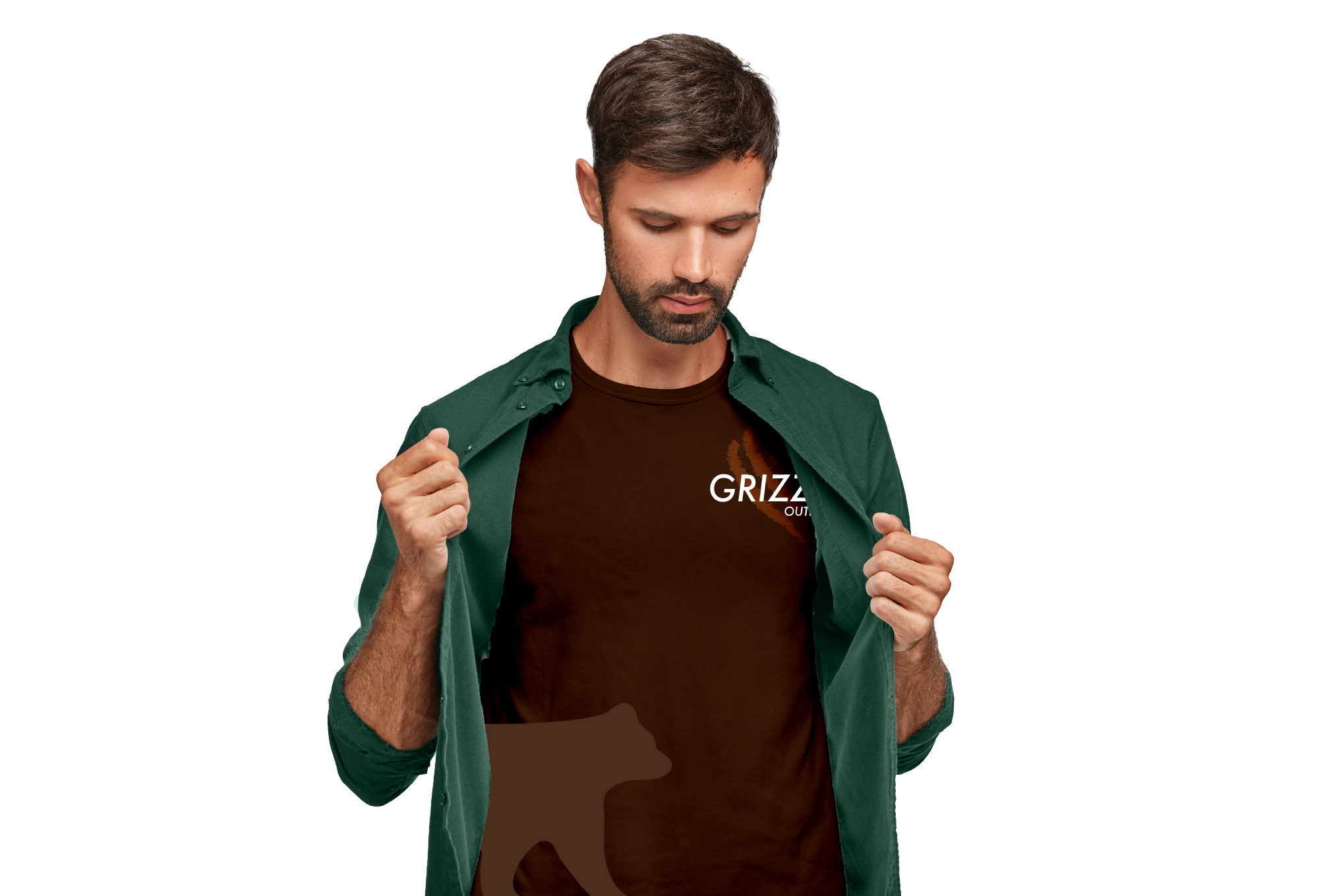
APPARELS

The logo design process began with moodboarding and sketches, exploring symbols of wilderness like mountains, antlers, and tents. We arrived at a mark that fused rugged aesthetics with modern geometry — a strong, symmetrical emblem representing trust, adventure, and exploration.

Research

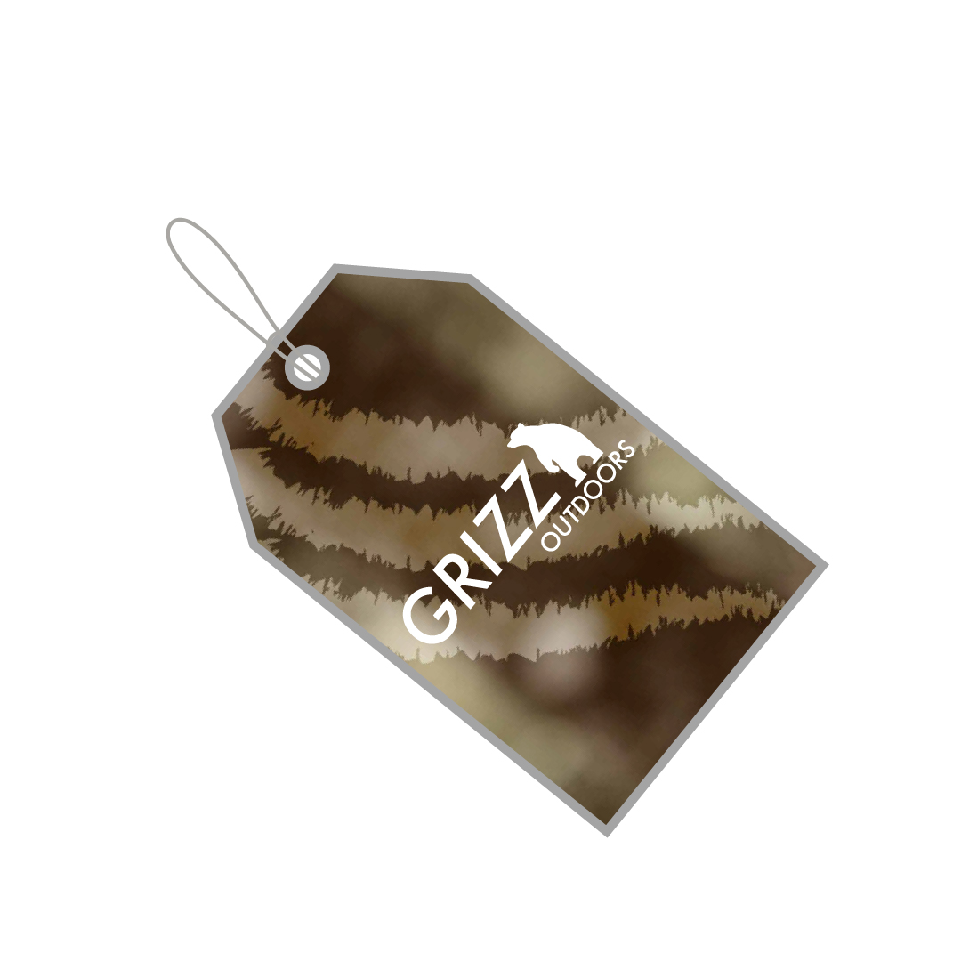
TAGS

Inspired by forest trails, natural textures, and twilight skies, the color palette of Grizz Outdoors includes deep greens, earthy browns, stone grays, and accents of golden sunlight. These tones create a grounded and inviting visual experience that resonates with outdoor adventure.

Wireframes

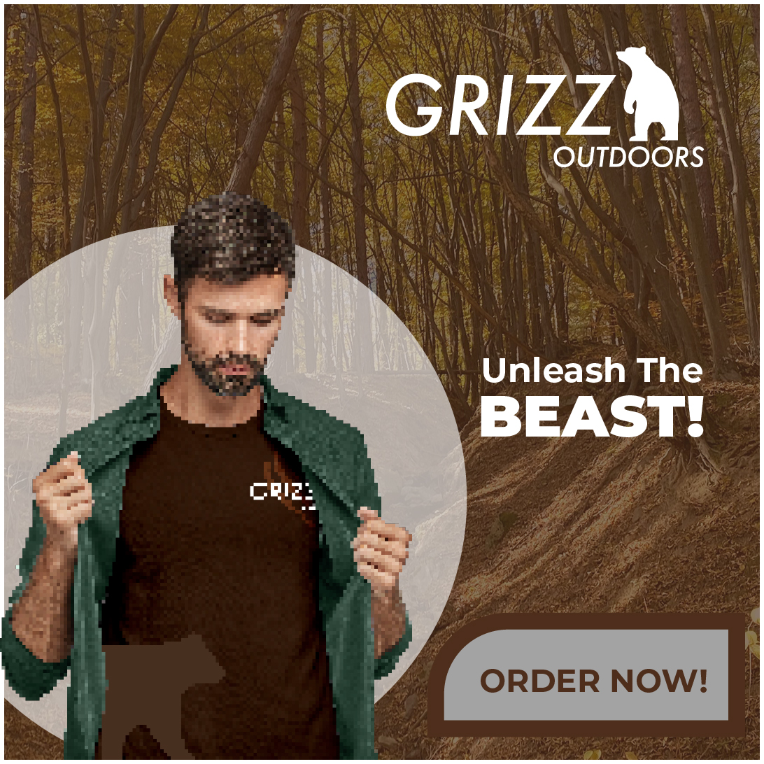
ANIMATED AD

The type system pairs bold, all-caps headlines with clean, legible body fonts. This combination provides both impact and readability — perfect for showcasing products and telling stories across devices, from large hero banners to mobile gear listings.

App Features

Multi-language Support
Real-time Trail Maps
Touch-friendly Navigation
Emergency Hotline Integration
Eco-friendly Kiosk Design

Challenges & Learnings

Designing for Grizz Outdoors required balancing rugged aesthetics with clean usability. The challenge was ensuring the interface felt adventurous and immersive while keeping it intuitive and user-friendly. Through iterative testing, I learned the importance of visual hierarchy, consistent iconography, and reducing friction during product discovery and checkout.